Mobile-First Luxury: Why 68% of Affluent Travellers Research on Mobile — And Most Hotel Sites Fail Them
The majority of luxury travel research starts on a phone. Mobile conversion rates are 2–3× lower than desktop on most hotel sites — not because guests won't book on mobile, but because the experience doesn't let them.
There is a persistent assumption in luxury hospitality that affluent guests prefer desktop. They use laptops for serious decisions, the thinking goes, and phones for casual browsing. The data has not supported this assumption for several years, and in 2026 it is actively misleading the design decisions of a significant number of properties.
68% of luxury travel research now begins on mobile. 40% of high-net-worth travellers complete bookings entirely on mobile without switching to a desktop device. The guest who is deciding between your property and a competitor down the road is, more likely than not, making that decision on a phone — in the back of a car, in an airport lounge, or in the thirty minutes before sleep.
Why Mobile Conversion Lags — And Why It Doesn't Have To
Mobile conversion rates on hotel websites are typically 2–3× lower than desktop rates. The industry treats this gap as an inherent characteristic of mobile commerce — guests browse on mobile and book on desktop. That characterisation is incorrect. The gap exists because most hotel websites were designed desktop-first and adapted for mobile, rather than designed with mobile as the primary use case.
The failure modes are specific. Navigation menus that collapse into hamburger patterns with three levels of nesting require four taps to reach a room category. Hero images optimised for landscape viewports look cropped and poorly composed in portrait. Booking date pickers are rendered in calendar formats that are finicky to use on a touchscreen. Form fields lack appropriate input types, causing the wrong keyboard to appear. CTA buttons are sized for cursor clicks, not thumb taps.
None of these are unfixable. They are consequences of a design process that added mobile as a step rather than starting from it.
What Mobile-First Design Actually Changes
A mobile-first design process does not mean building a stripped-down version of the desktop site. It means making every design decision — layout, typography, interaction patterns, content hierarchy, booking flow — starting from the constraints and affordances of a mobile viewport, then scaling up to desktop rather than down.
The practical differences are significant. Navigation is designed as a single-level or two-level structure that works with one hand and reveals the property's content architecture clearly. Hero photography is art-directed for portrait orientation, not cropped from landscape. The booking flow is touch-optimised: date selection uses a swipeable calendar, room selection is card-based and scrollable, and the payment form respects autofill and appropriate input modes.
Typography scales differently on mobile. The generous display type sizes that work on a 1440px viewport can feel overwhelming at 390px. Modular type scales — where heading and body sizes are defined as ratios rather than fixed values — allow typographic hierarchy to adapt gracefully rather than requiring separate mobile typography rules.
The Booking Flow Is the Critical Path
Every improvement to mobile experience upstream of the booking flow is undermined if the booking flow itself fails on mobile. This is where most hotel websites lose the guests who have been sufficiently engaged to reach the conversion point.
We design booking flows for mobile with a specific set of principles: one decision per screen (date selection, then room selection, then guest details, then payment — not all at once); progress indication so the guest knows where they are in the process; persistent display of the selected dates and nightly rate so the guest does not have to remember what they chose; and trust signals — cancellation policy, rate guarantee, security indicators — placed immediately before the payment confirmation step, where hesitation is highest.
Properties that invest in a mobile-optimised booking experience see the mobile conversion gap narrow substantially. At the upper end of the luxury market, where the booking value is high and the guest has already demonstrated intent by reaching the reservation step, the commercial impact of closing that gap is immediate.
Keep reading

AI & Technology · 17 April 2026
Everyone's Building Tools With Claude. The Hard Part Is Shipping Them.

Development · 17 April 2026
Umbraco vs WordPress: Why Serious Businesses Are Making the Switch
AI & Technology · 17 April 2026
Umbraco 17 Is Here — And It Changes How You Work
Also from our work
Eunoia
Eunoia – Praxismenedzsment terapeutáknak
Egy praxismenedzsment operációs rendszer pszichoterapeuták számára – amelyet azért fejlesztettünk, hogy csökkentse a terápiás munka adminisztratív terheit, így a szakemberek arra fordíthatják az idejüket, ami igazán számít.
View article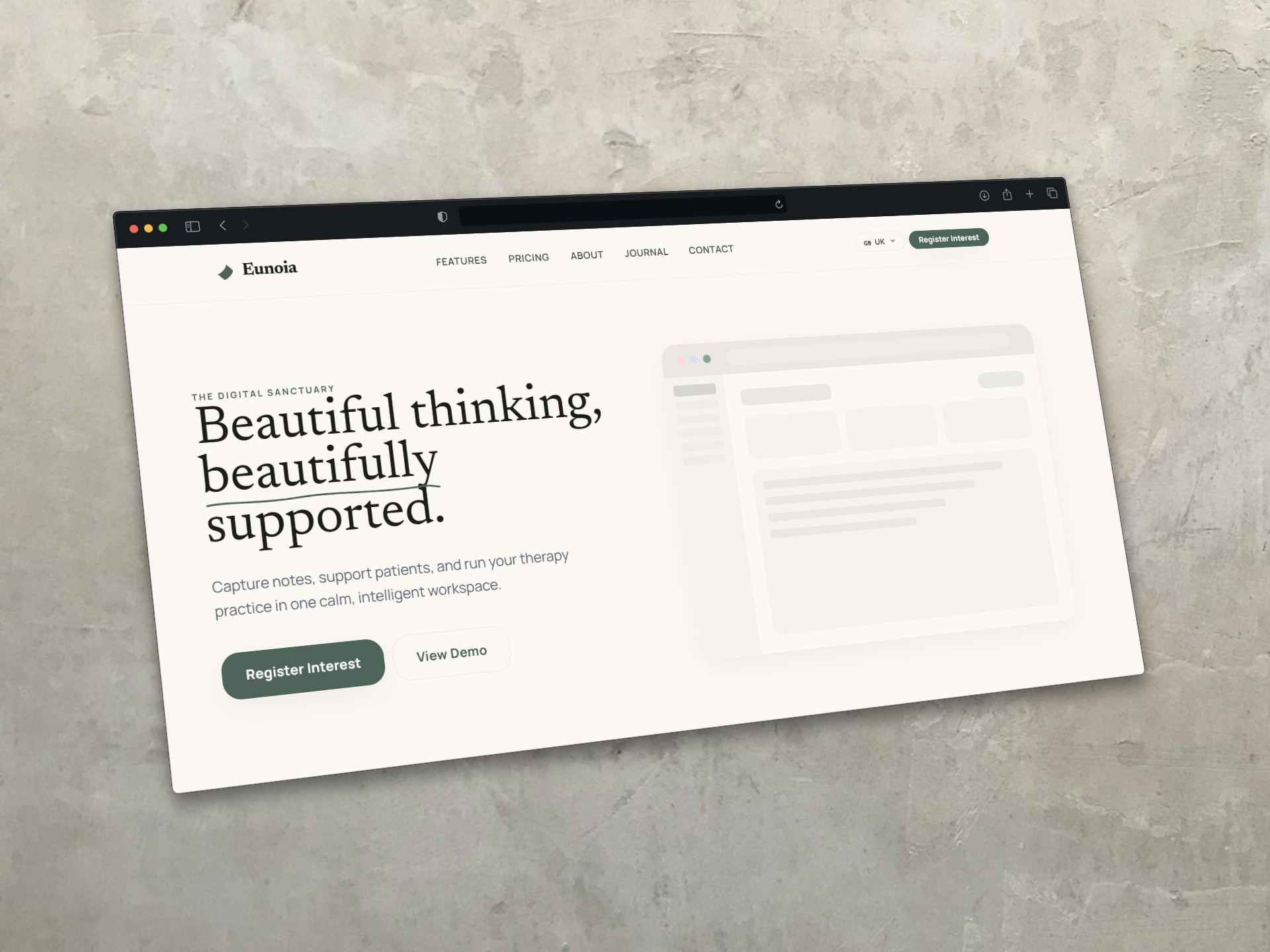
Keep Reading